
It's April 21st today. Unless you've been living under a rock, you know today is the day that Google's Mobile Algorithm sets in.
Actually, there has already been movement in the SERPS for a couple of months now regarding Mobile Friendly sites.
First of all, it is NOT the end of the world. So if you are panicking because your site is still not mobile friendly, relax. 
There is a lot of “end of the world for your website” rumors and such all over the internet and on social media and landing in your email inbox.
I am not diminishing the importance of being Mobile Friendly. I just want you to know the facts and what can you do to fix your site if you are not passing the Google Mobile Friendly test.
Your site won't be de-indexed or punished for not being mobile friendly.
Google is not trying to punish us. In fact, this is the first time in the history of Google that they have actually come out publicly to announce an algorithm change. That is unprecedented. That right there, tells us that they are giving us fair warning of this change and they also know that this will affect SO many businesses that they gave plenty of time for site owners to make sure their sites are mobile friendly.
What is going to happen is that if your site is not mobile friendly- it will have an impact on the Mobile Search rankings.
Google will show the mobile friendly websites first in the mobile search results. They are not getting rid of your site.
What this means is that Google is going to detect those who are on mobile devices when they are searching. Those results will appear to the searcher who is searching for keywords on their phones.
So if your site is not mobile friendly your rankings will take a beating. But let's say that your competitors are also NOT mobile friendly:). Well, we shall see what this looks like starting today! It is best to be the first one mobile friendly!
BUT this does not apply to your desktop rankings. And Google has announced this will also not apply to iPads and other devices like that. It does not apply to laptop rankings.
What can you do right now, today to get your site mobile friendly?
Before you do anything make sure your site's theme does not have a mobile update.
Sometimes all you need to do is update your theme in your wordpress dashboard and you are set.
This is a quick band-aid that you can do right now if you have a wordpress website:
1. Go to your wordpress dashboard.
2. Move your mouse over “appearance”.
3. Click on “themes”.
You will see these free wordpress themes:
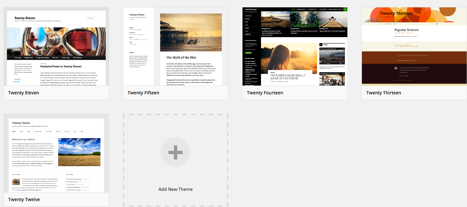
4. Choose any of these themes. Remember, these are not a permanent resolution. But all of these are updated constantly by wordpress. They are the only safe free themes that you can apply.
5. Click on the theme and then click “activate”.
Warning: You won't lose your posts, tags, categories, etc. You may lose other data. Always do a back-up of your site first. There are no guarantees that some of your data won't appear wonky or have alignment issues, etc. We are not responsible for anything that goes amiss on your site or anything else happens to your site.
Now go to the Google Mobile Friendly testing page here:
https://www.google.com/webmasters/tools/mobile-friendly/
Add the URL of your site there and it will run a test on your site.
This fast fix is temporary but it gets your site to pass the test. Then you can start working on getting another theme that is mobile friendly.
Mobile Friendly and Responsive are not the same thing.
A mobile friendly site must be usable, legible and available.
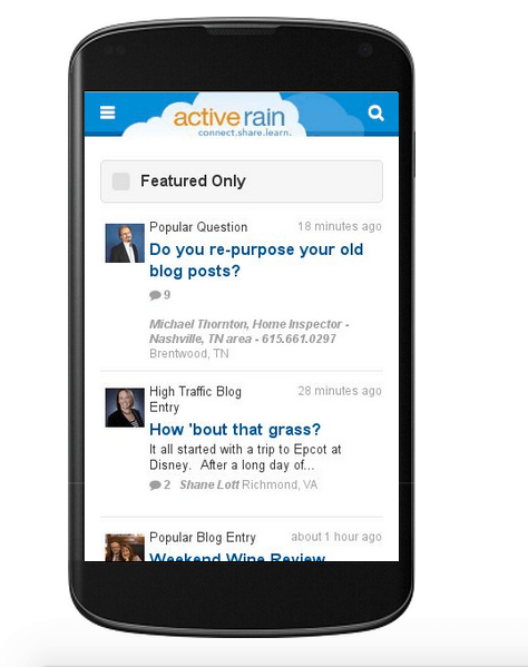
Mobile Friendly means that someone searching on their phone clicks your website they get a mobile version of your website. Here is an example of what that might look like:
What is important for Mobile Friendly:
* Large text that's easy to read ( I've been saying this for years:))
* The content fits on the small screen
* Well- spaced links
* Mobile friendly plugins
You are not alone if you are not mobile friendly. Over 40% of the Fortune 500 companies are NOT mobile friendly.
Mobile search is so important today and Google knows that. That is why they are working to make sure that the search that mobile users receive is a great experience. 67% of all searches are from mobile devices now. Google is not making money on mobile search because people don't like the mobile web experience they are getting. Google needs to make money somehow on all this mobile search.
One way they can do that is to force website owners to make their websites mobile friendly so that the user experience becomes a good one, then Google will be able to monetize better.
Responsive Design:
Responsive design means that your website will adjust to any screen that it is on. Your site determines what someone is searching on – desktop, laptop, smart phone or iPad. It also fits to the size of the screen that is viewing the site. That means that your responsive website looks good on a 21 inch screen or a 12 inch screen.
It is important that your end goal should be for your website to become responsive. There are a lot of great responsive themes on the market.
Right now it is more important for your site to be mobile friendly versus responsive because that is what Google is focusing on right now.
However, the problem that happens with mobile friendly is that ALL your pages may not be mobile friendly. The question arises is:
Will Google rank your pages or just your site?
Right now Google says it is page by page. But we all know that Google changes:).
If your site is mobile friendly with 50% of your pages but your competitor has 70% pages mobile friendly – is that going to hurt your rankings?
Google has not indicated how this will affect your rankings.
What if you know your site is mobile friendly but you are still failing Google's mobile friendly test?
This could be a very simple issue with your wordpress settings. Check your settings.

Make sure the box is NOT checked where the arrow indicated in the above screenshot.
Google bots can not crawl your site in order to even check to see if your site is mobile friendly and worse yet, your site won't get indexed.
Feel free to contact me to go over your website options. We can go over your site together and figure out your best course of action in moving forward and becoming mobile friendly and/or responsive.